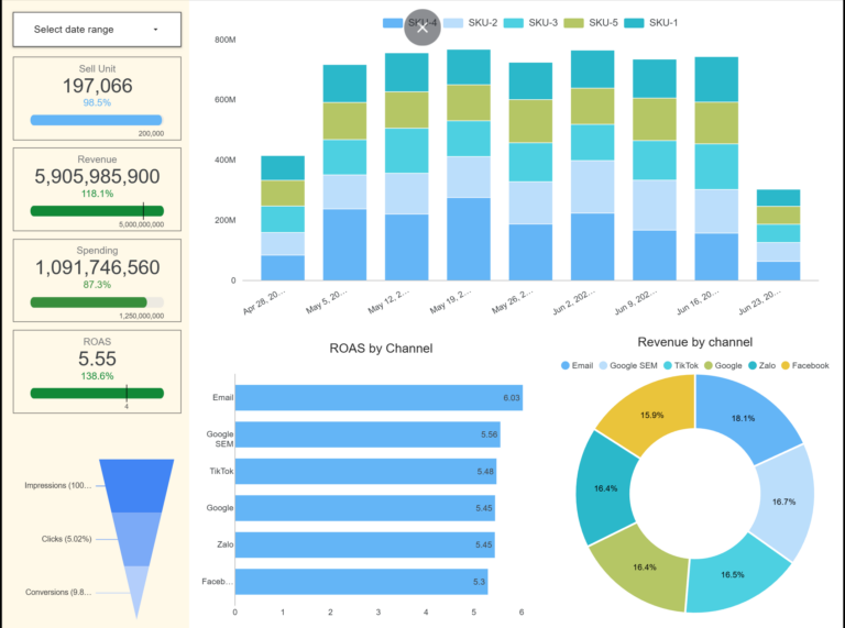

Many marketing teams have plenty of data and beautiful dashboards, yet still make decisions on gut feel, because the problem is not the tools but the thinking behind the data. This article names the 5 most common data reasoning traps that make data-driven marketing ineffective and waste budget, with a way out for each.
“Data-driven marketing” is a keyword that has shown up everywhere in recent years, from proposals to plans to job descriptions. And many marketing teams and agencies have indeed built gorgeous dashboards.
In contrast to that very digital-looking surface, a PwC survey found that 63% of CMOs admit they have missed opportunities because they could not make decisions fast enough. The truth is that many marketing teams hold the data and the impressive dashboards, but when it is time to decide, they still run on… feelings.
From my own experience and conversations with peers in the industry, here are the 5 “data reasoning traps” that lead marketers to use data ineffectively and waste budget.
📌 Key Takeaways
- The 5 traps: (1) confusing correlation with causation, (2) obsessing over vanity metrics, (3) disconnected analysis (data silos), (4) confirmation bias, (5) mistaking visualization for analysis.
- The common root: using data to reassure a gut feeling instead of to verify and decide.
- The way out needs no massive system or giant budget, just the right mindset and a step-by-step path: learn as you go, optimize as you learn.
Mistake 01: Confusing Correlation with Causation
This confusion usually happens when we look at a chart, see two variables A and B rising or falling together, and conclude that A causes B (or the other way around).
Example: You see the number of Fanpage posts go up, and that month’s revenue goes up too. You conclude: “The more we post, the more we sell”.
Reality: That month may simply have been peak season (like Tết, the Lunar New Year), when customers come to buy on their own, and your posting schedule was a coincidence. When the season ends and you keep posting just as hard while revenue slides, that is when the surprise hits.
In data language, this is the classic mix-up between Correlation and Causation:
- Correlation: Two variables move together (both up or both down) or in opposite directions over time or within the same context.
- Causation: A deeper relationship in which factor A genuinely drives the change in factor B.
When you identify the wrong cause, you invest budget in the wrong place and optimize the wrong lever, so resources drain into something that does not actually create the result.
Back to the example: once you believe “posts = revenue”, you pour budget into producing more content, more design, more ads for those posts. But because it was never true causation, when peak season passes you get the painful scenario: costs spike while revenue stalls or drops. You are burning resources optimizing a freeloader, not the driver.
To be fair, correlation is not the villain. It is actually a precious signal. Like smoke: seeing smoke does not guarantee fire, but it tells you which direction to check and to get ready to act. To make the most of these signals:
- Build hypotheses from the correlation: When A and B move together (or in opposite directions), ask: “Does A really drive B, or are both driven by a third factor C (seasonality, competitors)?”.
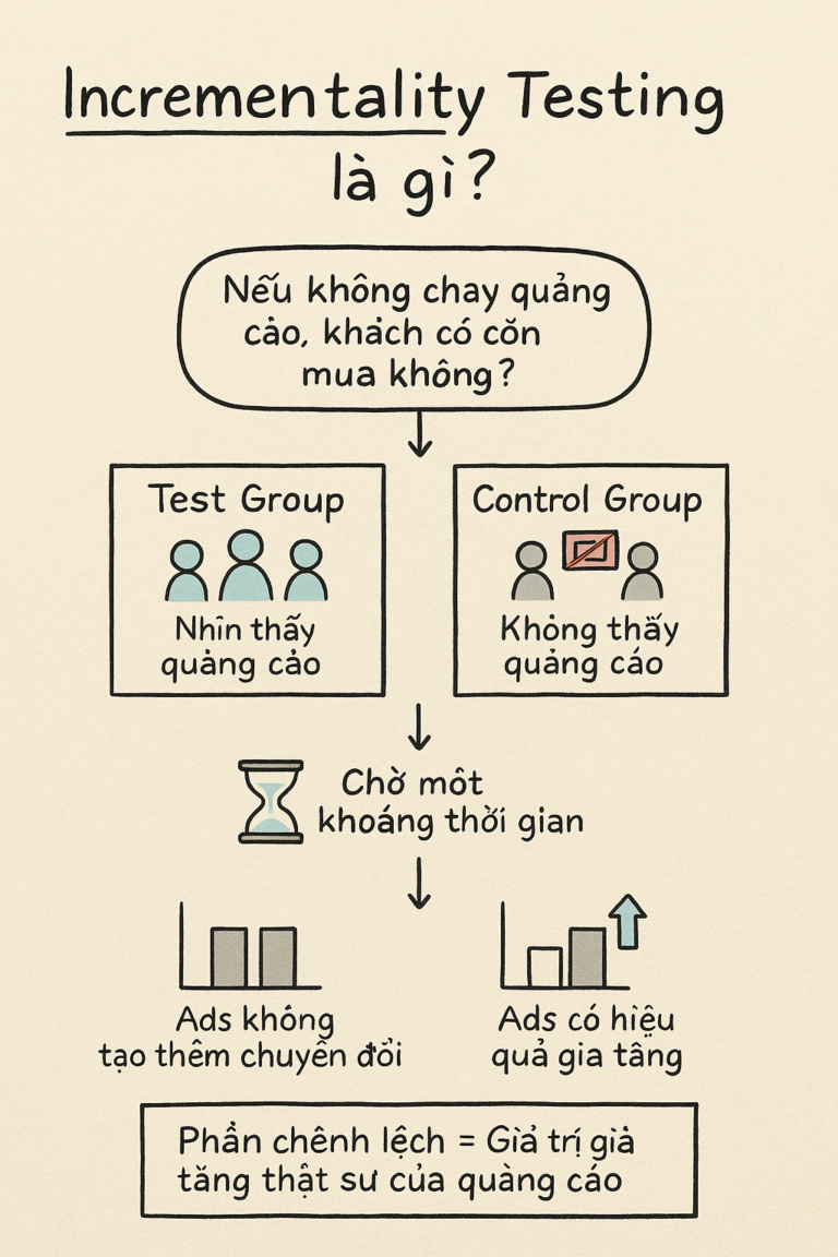
- Verify with experiments: This is where A/B Testing or Incrementality Testing comes in to establish causality.
- Regression analysis: For longer time windows, use regression to untangle correlated factors and find which one truly carries the most weight on the final result.
Mistake 02: Obsessing over Vanity Metrics
Marketing carries KPI pressure like everyone else, yet rarely gets to touch the product core or close customers into revenue directly. On top of that, marketing’s work is the kind everyone in the organization feels qualified to critique: anyone can say this image is ugly or that clip is boring.
Under the pressure to prove their worth to everyone, marketers slide into showing off numbers that sound huge: “Look how effective I am!”.
Example: A report with 1 million Reach, 50,000 engagements and 10,000 minigame comments of people typing “.” to claim a gift. It looks lively, and the marketer feels more confident.
But when you become obsessed with dressing up reports with vanity metrics, the consequences arrive fast:
- Optimization drifts off course: The content team chases clickbait for volume and forgets to educate customers about the product’s value.
- Wasted resources: You pay for junk clicks or for audiences who only love free stuff.
- Lost internal credibility: The classic scenario: Marketing reports floods of leads (quantity), Sales calls them and 90% say “I clicked by mistake”. Data stops being the common language and becomes a source of conflict.
To sober up from vanity numbers, marketers need a filter that shows which numbers actually make money. Practice translating the business problem with these methods:
1. Identify the business’s North Star Metric. The North Star Metric is the single most important metric a company uses to measure the value it delivers to customers, the one that predicts revenue growth potential and retention.
Would revenue and profit not be the obvious choice, then? The catch: revenue and profit are lagging indicators. Meanwhile, metrics like total registered users or page views often misrepresent reality. Early Facebook did not use registered users (too many dormant fake accounts) but Daily Active Users (DAU) as its North Star Metric. Zoom chose weekly meetings created.
2. Design a Metrics Map. From the business’s North Star Metric, marketing identifies the input metrics it can influence. To find them, map the customer journey and understand why the main metric rises or falls.
After listing a long candidate set, apply an “80/20 filter” to pick the 1-2 metrics that matter most. Ask:
- If this metric rises, does the main metric surely rise? (Reach up does not guarantee sales up, but AOV up while order quantity holds guarantees revenue up.)
- Can I actually influence this metric? (If the market sets it, like CPM or search volume, it is not a Key Metric for you to own.)
Example of the translation frame from business question down to data question:
| Level | Question | Metrics |
|---|---|---|
| 1. Business Question | “How do we grow this month’s profit by 20%?” | Profit, ROI, Revenue |
| 2. Marketing Question | “Is growth coming from acquisition or retention?” | CAC, Retention Rate |
| 3. Data Question | “Which channel converts best at the lowest cost?” | CR, CPA, AOV |
Mistake 03: Disconnected analysis (the Data Silo trap)
Here is a truth few people appreciate: Marketing owns the most complex data in the entire organization.
While Accounting and Sales usually work on one centralized system (ERP/CRM), marketers swim across dozens of platforms: Facebook, Google, TikTok, email marketing, web analytics… Each platform defines data its own way, and dimensions like Creative, Campaign and Audience change and update by the hour.
It does not stop there: to know whether an ad dollar actually produced profit, the marketer has to go “borrow” data from Sales (close rates) and Accounting (return rates). This particular fragmentation makes marketers the biggest victims of Data Silos.
Because the data is so fragmented, we end up seeing results everywhere but never the whole picture:
- Blind optimization: Facebook CPA looks cheap so you add budget, not knowing that 80% of those orders are fake or junk customers according to the CRM.
- Misjudging the key driver: You cut the YouTube budget because it produces no direct orders, not knowing those videos are exactly what sends customers to search and buy on Google later.
To escape the silo trap, start with these 2 moves:
1. Build the “red thread” (Identity Resolution). Do not try to connect everything at once. Focus on joining data through shared touchpoints (usually phone number, email or UTM parameters). This is how scattered data becomes one continuous Customer Journey across platforms and down the funnel.
2. Think “Whole-of-Business”. Instead of reporting only clicks and leads, proactively ask to integrate CRM and Accounting data into your dashboard. Once you can see LTV and Profit per Channel, your budget decisions become sharp and hard to dismiss.
Mistake 04: Confirmation Bias
In marketing we all have our brainchildren: a campaign you stayed up all night to conceive, or a message you are certain customers will love.
Because we care so much, we slip into Confirmation Bias: unconsciously hunting only for numbers that support our view, while ignoring (or explaining away) the numbers that prove the opposite. Many marketers use data the way a drunk uses a lamppost: for support, not for illumination.
Example: You launch a new creative. The data shows a very low CTR, but you cling to a few “beautiful photo!” comments to reassure yourself: “The audience must be off, the content itself is great”.
The consequence: Instead of stopping to fix the mistake, you keep funding an underperforming campaign just to prove yourself right. The budget drains while the business goal stays out of reach.
When personal bias overrides data, you lose your agility. In a digital environment that changes by the hour, clinging to a wrong hypothesis wastes money and burns the golden window for finding what actually works.
To keep your ego from fooling you, try these 3 “mind-cleansing” techniques:
1. Flip the approach: from proving to disproving. Instead of collecting evidence that you are right, do the reverse. Set the null hypothesis: “This campaign is actually NOT effective; the recent growth was luck or external factors”. Then use a logic tree to list every other cause that could explain the growth (a competitor paused their ads, peak season, an ops change…). If you cannot break that null hypothesis, your faith in the campaign has no foundation.
2. Apply objectivity techniques: Blind Analysis and Devil’s Advocate.
- Blind Analysis: If you fear favoring a “pet” channel, have a colleague (or AI) mask the campaign/channel names and leave only the raw numbers (CPA, CR, ROI…). Judging data without knowing whose it is makes the cut-or-scale decision far more honest.
- Devil’s Advocate: In reviews, assign one person (or ask AI) to attack the report and present worst-case readings. AI is great at this with a prompt like: “Here are my results. Play devil’s advocate and give me 5 reasons this data may be lying to me”.
3. Lock a consistent set of success metrics. Bias makes marketers “hop” between metrics: when sales dip, show off likes; when likes dip, show off reach. Lock your success metrics (the North Star Metric) BEFORE the campaign starts and commit to not changing them mid-flight. Use MECE to keep the set comprehensive without overlaps. If the campaign misses the committed metrics, then no matter how pretty the side numbers look, accept that it missed.
A professional marketer is not afraid of being wrong, only of not knowing where. With these technical anchors in place, you escape the gut-feel trap and decide on objective truth.
Mistake 05: Mistaking visualization for analysis
A familiar story: a business or marketing team decides to level up and enrolls in Power BI and SQL courses en masse. The direction is right, but the rollout often turns marketers into someone who buys a washing machine only to spin-dry clothes, while still washing everything by hand.
Every week, data is still processed manually: filter, fix, copy from one file to another. Only after the manual work does the data get dropped into a source file connected to the visualization tool, then… hit refresh, once a week, even though the raw sources could connect directly and refresh hourly. The charts update automatically with every new dump, the colors look gorgeous, and everyone calls it “data analysis”.
But the moment an unexpected question appears: “Wait, why did this SKU drop so hard this week?”, the whole team stares at each other. The dashboard is beautiful, but the answer is nowhere. So everyone crawls back to Excel, scanning rows and filtering cells to hunt for the cause.
The consequences of this half-baked data practice:
- Slave to the shine: You save no time at all. You are stuck in the “report beautification” trap: instead of letting an automated data flow process data hourly so you can focus on decisions, you spend hours of manual work in exchange for a professional-looking chart.
- Manual cracks, real risk: Humans always err. One forgotten de-duplication or one misdragged VLOOKUP while merging files and the numbers are off. You are making important decisions on spreadsheets that can silently break at any time.
- A data integrity crisis: When everyone cleans data their own way on their own machine, the Single Source of Truth is gone. Media reports one number, Sales reports another, and the strategy meeting turns into an argument about whose number is right.
The opposite failure also exists: teams that do automate, but cram everything into one tool. With something as powerful as Power BI, storage, processing and display often end up living in one place, usually to save upfront cost or to avoid learning another tool. The consequences:
- Heavy, slow systems: Stuffing millions of raw rows and complex DAX calculations into one file makes the report crawl. Every refresh takes 15-30 minutes or hangs the machine, so the data is never current.
- Inflexible, hard to scale: Power BI is a beautiful dining room, not a professional kitchen. As data swells from many sources (Ads, CRM, Web), forcing all logic into one file makes the system fragile. One source changes its format and you are digging through hundreds of processing steps inside that file, instead of adjusting one layer in the “kitchen” (ETL).
- Data locked away: Clean data trapped inside a report file cannot be shared. You worked hard cleaning customer data in Power BI, but when Finance needs it for reconciliation in Excel, they cannot get it out and have to clean from scratch. The cycle repeats, bloating the workload and the junk data.
To keep your dashboard from becoming a static painting or a lumbering machine, reset your system thinking with 3 principles:
1. The right tool for each layer. Invest in learning and using the right tool for each job: a data warehouse for storage and cleaning, analysis tools for modeling, BI services and visualization for extracting insight.
| Layer | Role | Suggested tool stack |
|---|---|---|
| 1. Storage | The “warehouse” for centralized raw and clean data | Google BigQuery (flexible and friendly for non-tech users like marketers), Amazon Redshift, Microsoft Azure — cloud platforms that suit marketing’s pace |
| 2. ETL/Processing | The “kitchen” for filtering, cleaning and computing data | SQL and Python inside the warehouse; or simpler automated tools like Funnel.io, Supermetrics. My advice from experience: learn at least SQL so you can process data on your own terms |
| 3. Modeling | Building advanced analysis models | The BI tool’s language (DAX in Power BI; R and Python in Tableau), or SQL models right inside the data warehouse |
| 4. Visualization | The “dining room” where insight is served | Power BI, Tableau, or Looker Studio |
2. Build a Data Pipeline, not a Data File. Stop thinking about how to merge files. Think about how data flows, so that clean data is always ready for reuse across different dimensions and different stages of the customer journey.
3. Build a QC/QA system.
- Automated checkpoints: Use scripts to catch errors (empty values, wrong formats) right at the source. Data standardized by one shared rulebook kills the “every team has its own number” disease.
- Backup, backup, backup: What matters gets said three times. Daily backups are the lifeline for reconciliation and for keeping data integrity over time.
Conclusion: the journey from numbers to intelligence
We have walked through the 5 data reasoning traps that keep marketers from applying data analysis effectively. Recognizing the traps is a good start; do not forget the ways out:
- Instead of trusting your gut: use correlation as the clue, build hypotheses, and run experiments to confirm causation.
- Instead of chasing vanity numbers: apply the North Star Metric and the translation frame (Business → Marketing → Data Question) to distill the key metrics that create real value.
- Instead of living with silos: build the “red thread” (Identity Resolution) to connect data across the customer journey and become the owner of the data flow, not its victim.
- Instead of indulging your ego: set technical guardrails (Blind Analysis, Devil’s Advocate) that force you to face objective truth.
- Instead of serving the dashboard: build an automated data pipeline and shift toward predictive analytics, steering the future instead of staring at the rearview mirror.
If you feel overwhelmed reading this, worried about cost or deep technical knowledge, here is what I genuinely believe from my own path: applying data analytics in marketing does not have to start with massive systems or a huge budget. What matters most is the right mindset and a structured roadmap.
Marketing analytics is a long journey. Instead of changing everything overnight, start light with the spirit of agile learning: learn as you go, optimize as you learn.
Frequently asked questions
What is data-driven marketing?
It is marketing that uses data as the basis for decisions instead of gut feel. Having dashboards and data is not enough, though; what decides the outcome is sound data thinking: distinguishing correlation from causation, choosing the right metrics, connecting data and verifying objectively.
What is the difference between correlation and causation?
Correlation is when two variables move together over time or context; causation is when one factor genuinely drives the change in the other. Correlation is only a signal for forming hypotheses; causation must be confirmed through experiments such as A/B testing or incrementality testing.
What are vanity metrics?
Metrics that sound impressive but do not reflect real business value, such as reach, raw engagement or minigame comments. They dress up reports but can steer optimization off course and waste budget.
What is a North Star Metric?
The single most important metric reflecting the value a business delivers to customers and predicting growth, such as Facebook’s Daily Active Users or Zoom’s weekly meetings created. It keeps marketers from hopping between metrics to flatter the story.
How do you avoid data silos in marketing?
Start with Identity Resolution (joining data through shared touchpoints like phone, email, UTM) to build one continuous customer journey, then think whole-of-business by integrating CRM and accounting data into your dashboard to see LTV and profit per channel.
Read more: Marketing in the Age of Chaos: 3 Observations and the Sustainable Way Forward
Coming next: “The 4 Pillars of Marketing Analytics in the AI Era”. For a fuller execution map, the next deep-dive will share the 4-pillar framework: the backbone that helps marketers and marketing teams see where to invest, which skills to upgrade and how to build a data analytics practice for each stage of business growth.
📥 Subscribe to the Tuesday Brief “From Insights to Impacts” to get the next weapons on your way to becoming a true data-driven marketer.
Source: 63% of CMOs missed opportunities due to slow decisions — PwC Pulse Survey.